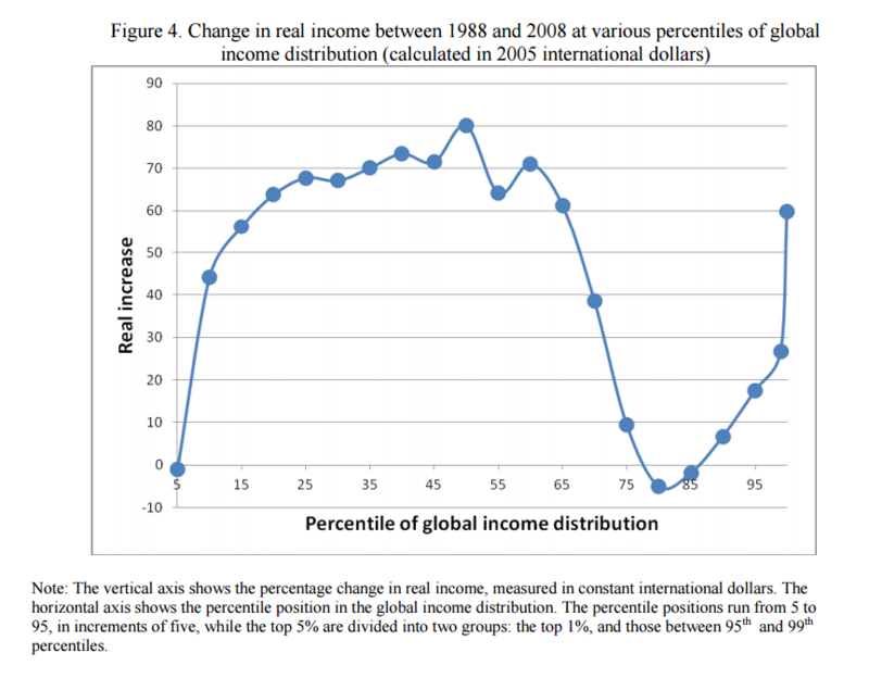
The elephant curve:
I should probably also mention that I stole this image from a bloomberg article
I had to read, and then re-read that caption a few times to understand what I was looking at. The axis across the bottom represent's your income percentile on a global scale, and the axis up the side is how much your income has increased in real terms since 1988.
There's two insights to draw here, firstly that globalisation hasn't been much benefit to those around the 85th percentile (the working class in developed nations), and secondly that trickledown economics has worked out great for the worlds richest 5%.
In my opinion (based on mere supposition and no real evidence) those two things aren't necessarily linked. I mean, generally globalisation has been great for everyone except those at around the 85th percentile. If it wasn't for trickledown economics maybe the curve would be less dramatic.